
Sometimes data science isn't the easiest thing in the world. For some projects, just getting the data to the point it can be analyzed can take hours, days, weeks, or months. Imagine the disappointment of working on a premise for several months, then analyzing the data only to find there's nothing insightful or conclusive about what you were studying. Even worse, discovering you were collecting the wrong data, missing key values, or formatted it incorrectly. How about finding that simply by doing the project, you now understand more about the data and insights you can derive than when you started, but you have little to show for the effort.
I recently had such a project. For corporate-impacting news, Bitvore tags each individual story with a signal. A signal can be any variety of important, time-sensitive concepts that include everything from seldom seen signals, such as a bankruptcy, to more common occurrences like lawsuits, executive changes, product launches, or earnings reports. Given that we have a critical mass of data and signals for tens of millions of corporate news items, I wanted to see if there is any correlation between sentiment and currency amount mentions in the news story.
In our production system, one entity extraction we pull into a tag is the dollar amount of currency mentions. Citations of $8M, $51,000, $200k, or even launching a new service for $100/month per user, etc. all get identified and put onto a list associated with the record. Likewise, those values are converted into absolute numbers so we can do quantitative comparisons. Currently we only do US dollar currency mentions, but with a little work, it'd be easy to convert 10M UK or 80K EU into absolute currency values based on the timestamp of the analysis. Here is the first attempt:
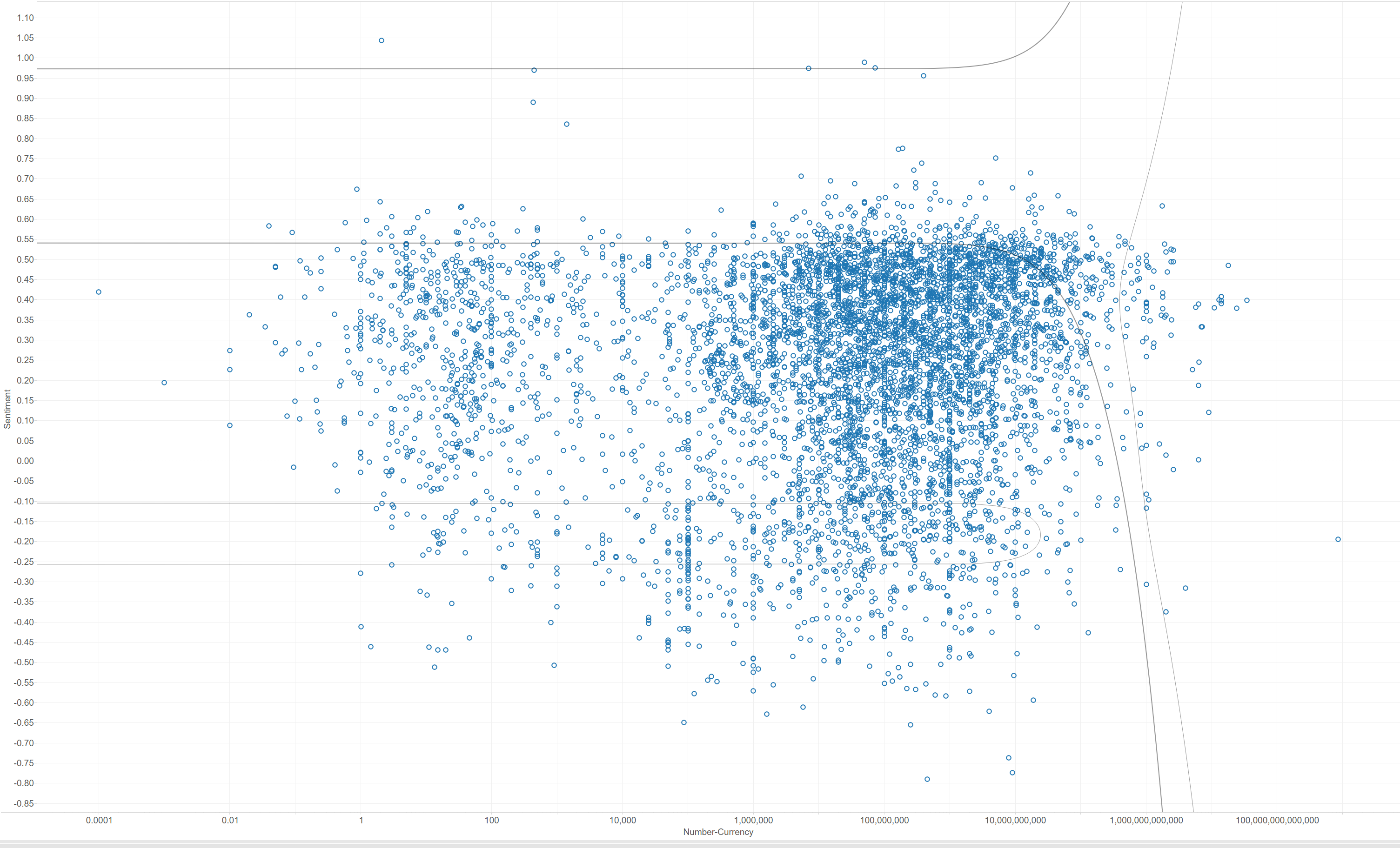
I graphed the relative sentiment from -1.0 to +1.0 along the left (y-axis) and the raw dollar amounts mentioned in the article along the bottom (x-axis.) Given the huge discrepancy between values mentioned, I ended up changing the x-axis to a logarithmic scale, meaning the distance between points plotted further to the left are a multiple greater than the ones on the right. More simply, it graphs out the values in a more understandable format, versus a graph larger than most computer screens.
What I discovered from the first graph: not very much. There are a lot of data points, they aren't very well clustered, and there are no lines to help make the data more understandable. The best conclusion I could determine was that 70% of business critical stories include dollar amounts mentioned between $10 million and $1 billion. A lot of the stories we identify as "business critical" include the word "million" or "billion" in the story, but that doesn't guarantee those stories are important. Disappointed with my results, I looked for another way to segment the data:
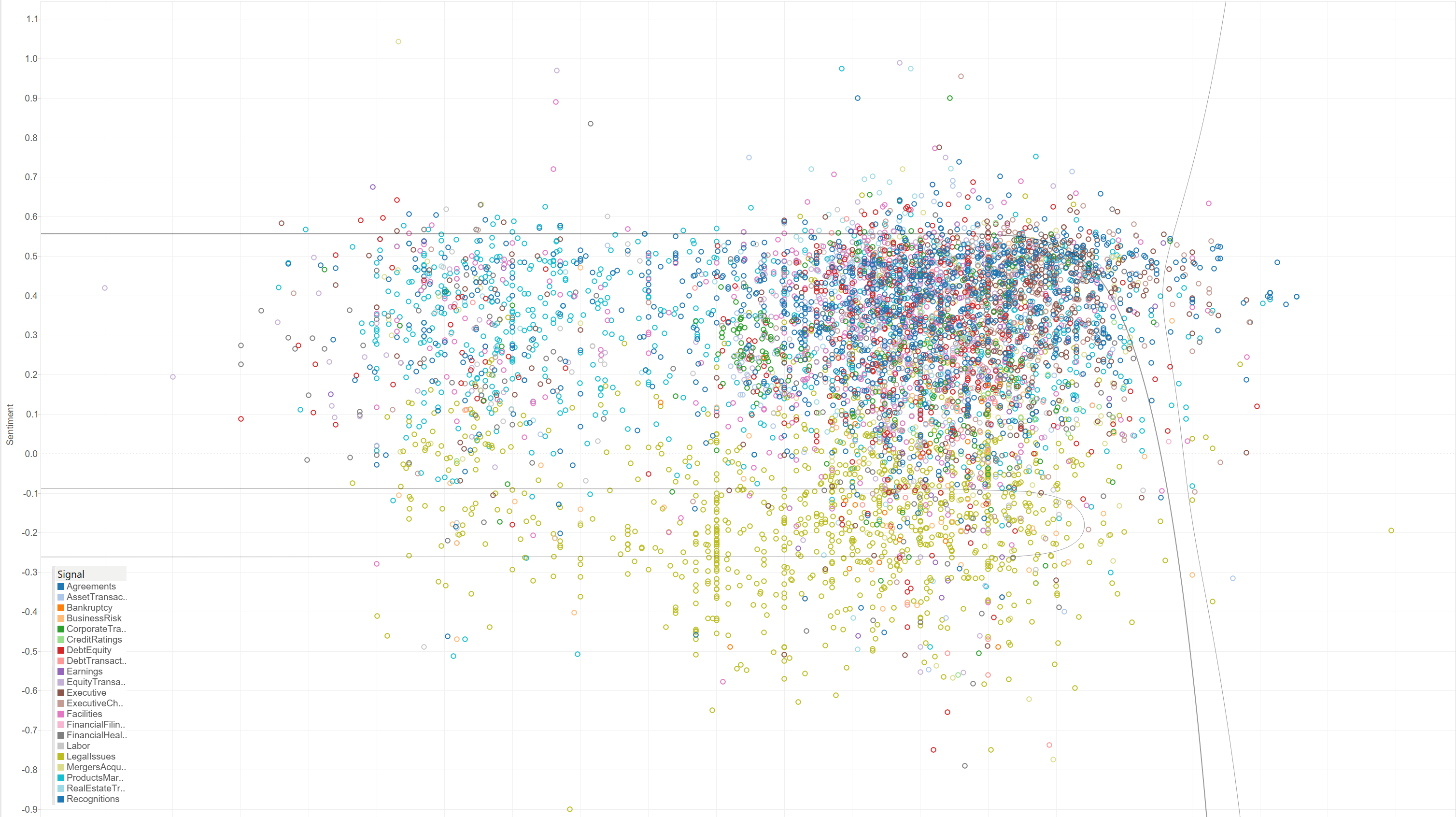
I decided to color the data points based on the type of signal the record had. I came up with the premise that like-things might possibly have like-values. While not necessarily any more insightful, there were a few more things that stood out. Product-Market announcements (teal) typically had lower dollar amounts than other signals. Agreements (navy) and Revenue Recognitions (dark blue) typically included large dollar amounts. Corporate Transactions (green) seem to cluster around the $1 million+ range, and are generally seen as positive. Two surprising results are that Legal Issues (yellow-green) and Mergers & Acquisitions (yellow) run the gamut from large to small, but typically are perceived as mild to strongly negative in the business press. There also are a few outliers. Large dollar Labor Issues (grey) are extremely negative. Some small dollar-mention Legal Issues are also highly positive. I was curious enough about the latter to look at some of the raw data. Typically a company settling a lawsuit without having to pay a lot of money is seen as a good thing. Wanting to explore this more, here's my third attempt:
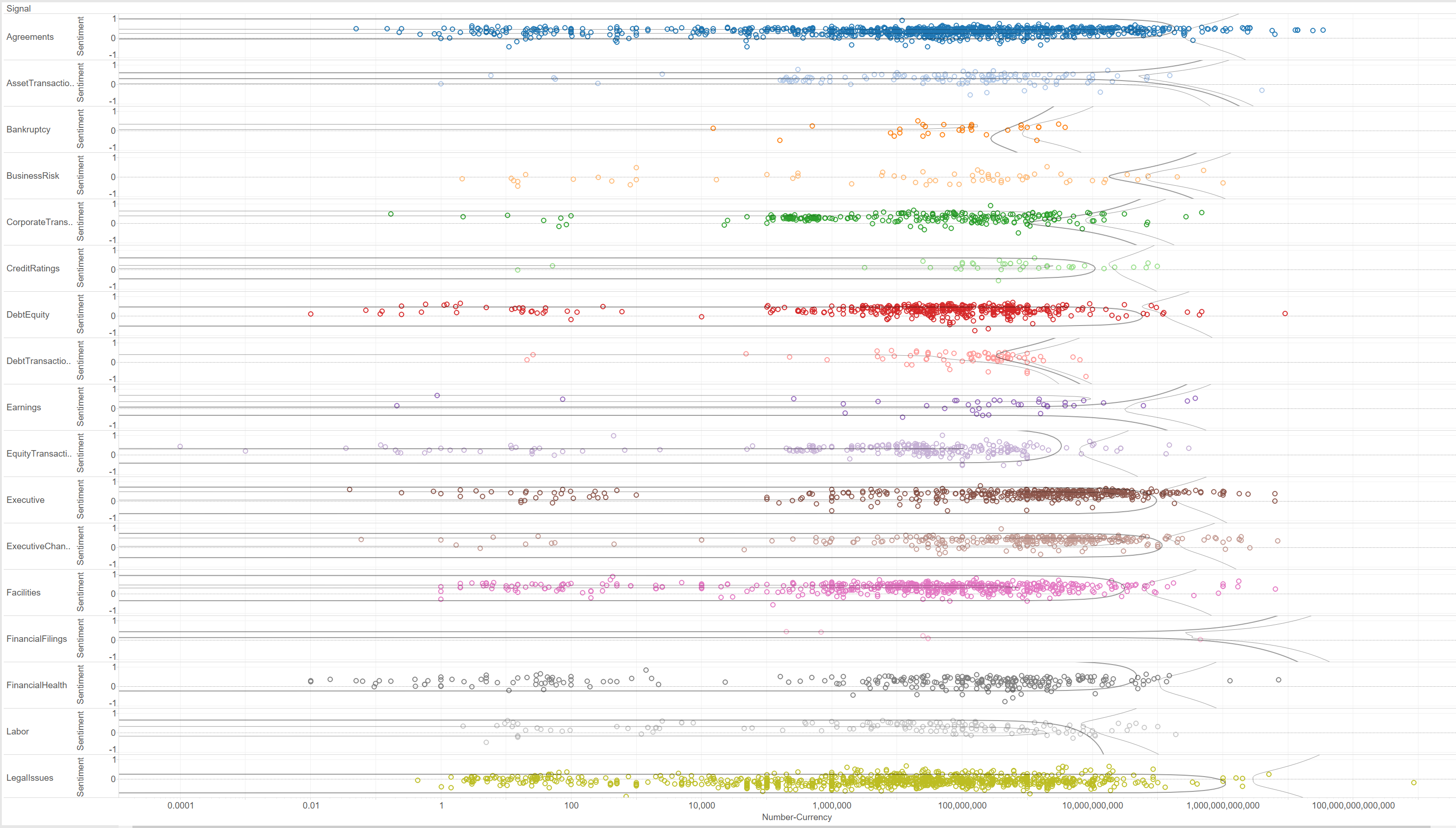
I wanted to try to figure out if there is some sort of global pattern for dollar amounts versus sentiment across signals. I plotted them one above another to see if there might be any discernible patterns I could explore with further modeling or data. Despite all the data, there isn't much to be learned from the experiment.
As best I could tell, news items with dollar mentions above $100 and below $10,000 are not that business critical or business impacting. With Bitvore, I was able to use several years of data and put the experiment together in about an hour. Even though there were no breakthrough insights, I was able to visually figure out if there were promising avenues of understanding to tease out of the data. I don't think there is a very strong correlation in business critical company news between sentiment and dollar amounts mentioned, but luckily I have hundreds of other tags and values to explore. On to the next project.